TL; DR - How I contributed
01. Identified and addressed inconsistencies, communication gaps, and accessibility issues in the design system.
02. Improved documentation clarity and streamlined design elements to enhance team collaboration and product consistency.
03. Advocated for compliance with accessibility standards.
Impact
Enhanced consistency
across the ecosystem
Streamlined
handover process
Improved Accessibility
across all components
Overview
Inconsistencies and lack of documentation were slowing down delivery
The discrepancies between our Figma designs and the actual development implementations posed a significant challenge. Design components often looked and behaved differently in the product, causing issues during handovers and implementation. This not only impacted the quality of our product but also resulted in time-consuming revisions.
We also faced the problem of having multiple components performing similar functions in our product. This redundancy not only confused our users but also meant that we had to maintain different code versions for essentially the same thing.
Accessibility was another concern, due to reasons such as elements that were not keyboard focusable or lacked sufficient contrast. Additionally, some components were in dire need of a styling refresh. They occupied excessive vertical space, hiding essential options from users and negatively impacting the overall user experience.
Process
The path to an improved design system
To tackle these challenges, I initiated a comprehensive audit of our existing design system. This involved a detailed review of each component to identify inconsistencies and areas that needed improvement.
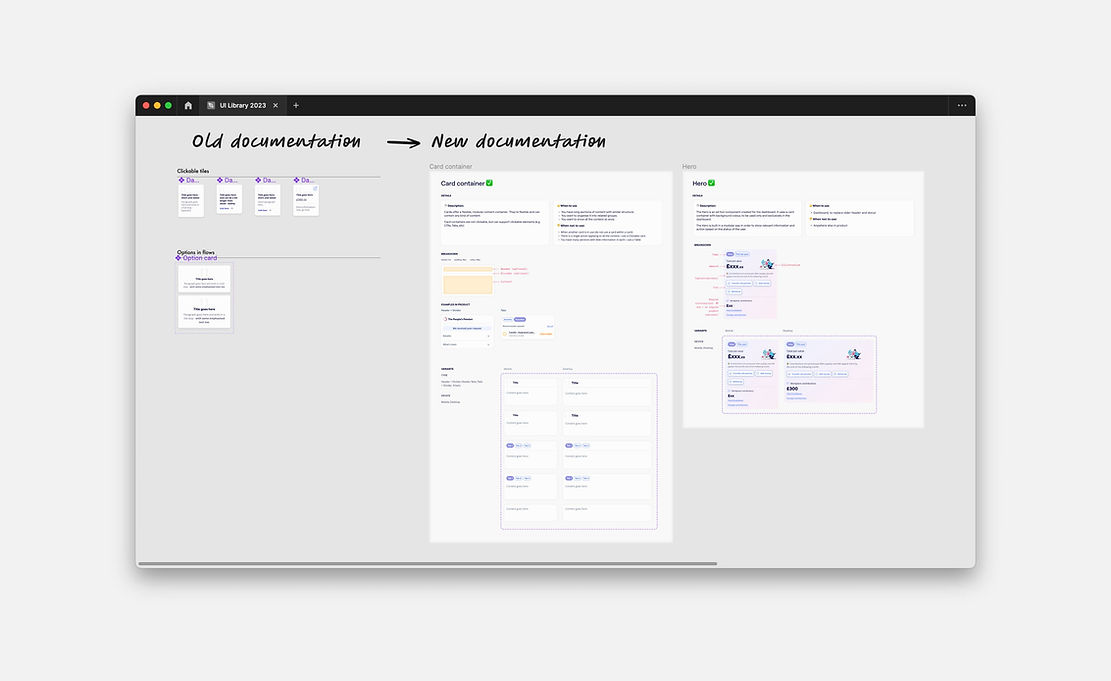
One of the most crucial steps was creating detailed documentation for each component. Throughout the redesign process, I maintained an open feedback loop with our front-end development team. I paired closely with our front end team to discuss implementation challenges and gather insights on how to proceed.

Design
Simplifying design elements, and streamlining documentation
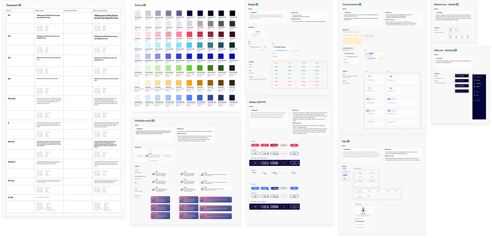
I carefully examined every part and created clear documents for each, including explanations, when to use them or not, how they work, and any different versions. I also simplified things by reducing unnecessary variations and making sure our documentation is straightforward for our team to use.


Outcome
Wins 🙌
Design consistency: The implementation of comprehensive documentation and regular feedback sessions led to a significant improvement in design consistency across our product. Designers and developers now had a clear understanding of how to use components correctly, resulting in a cohesive user experience.
Quicker handover: By bridging the gap between design and development, discrepancies between Figma designs and development implementations were minimized. This streamlined the handover process, reducing rework and improving overall efficiency.
Improved accessibility: Addressing accessibility issues improved the user experience for individuals with disabilities. Components now included essential accessibility features, such as focus states and proper alignments, making our product more inclusive and compliant with accessibility standards.